The Challenge
Revitalising a legacy SaaS platform
The Teacher2Parents platform was built on legacy technology with an outdated UI that no longer met the needs of its users. Navigation was confusing, the visual design lacked modern appeal, and compatibility issues across modern browsers limited accessibility. The objective was to redesign the product from the ground up — migrating the existing customer base from V1 to V2 without disrupting their workflows.
The Journey
From research to redesign
The project followed a structured two-part process spanning November to March. Starting with research and analysis, the team moved through conceptualisation and ideation, design iteration, visual design, implementation, and finally launch and evaluation. Two concept directions were explored — the first revealed critical usability issues that directly informed the refined second concept.
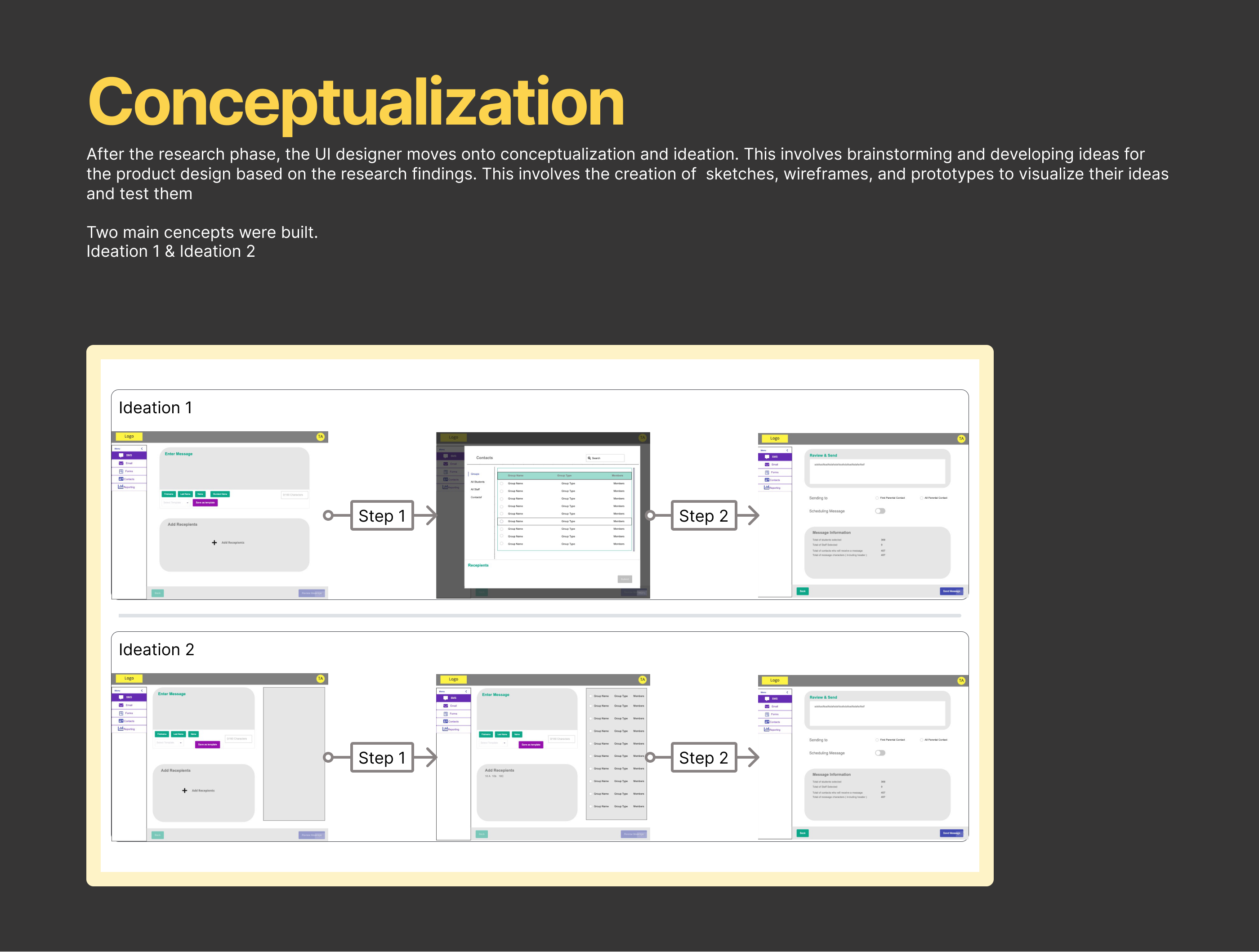
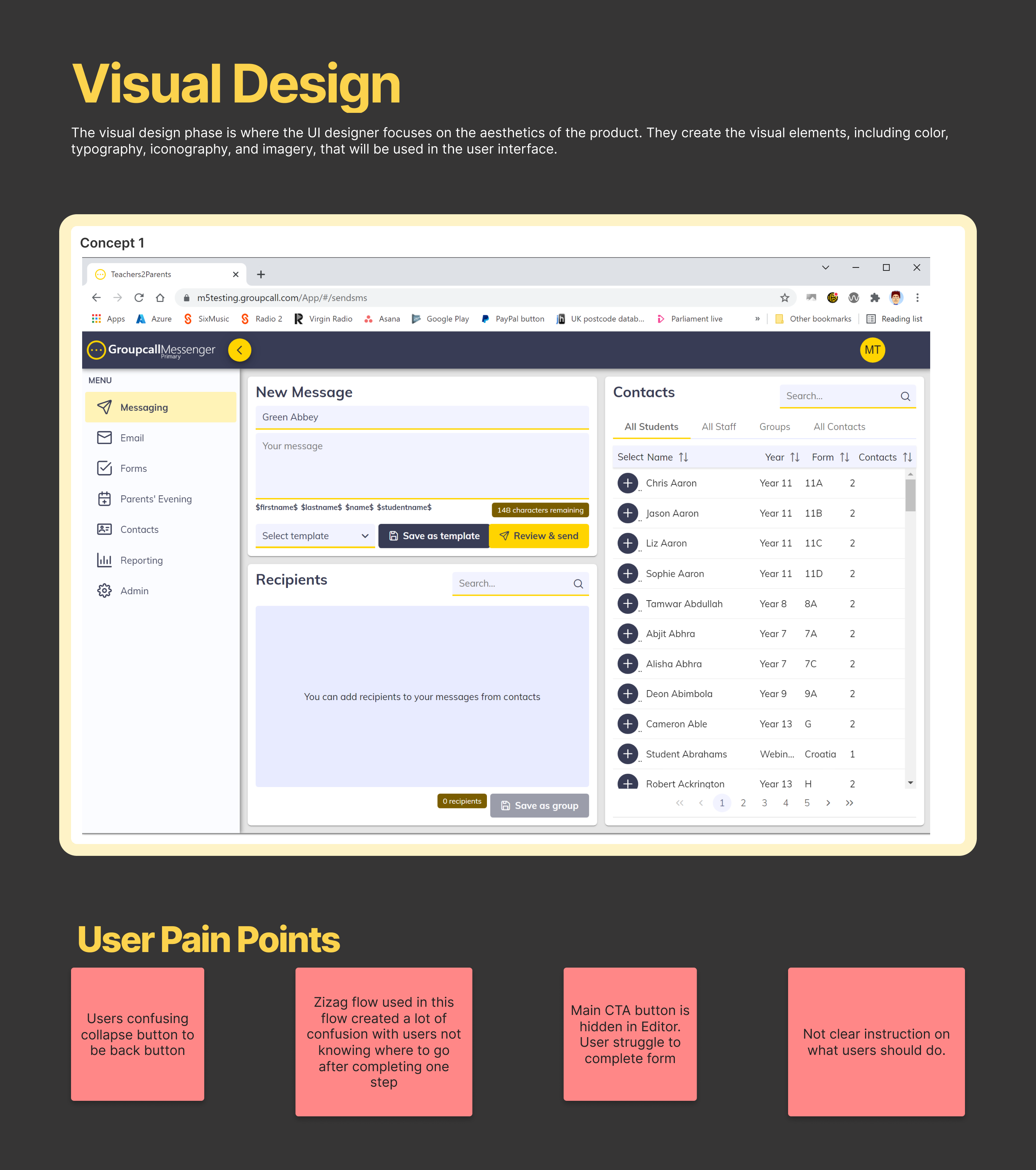
Conceptualisation — Concept 1 vs Concept 2 wireframe exploration
Before & After
Identifying problems, designing solutions
The first concept revealed critical usability issues during testing. Each pain point was systematically addressed in the redesign, pairing problems with targeted solutions.
Confusing Collapse Button
Users confused the collapse button with a back button, disrupting their navigation flow.
Back Button Repositioned
Back button removed from its confusing position and moved next to the main CTA to avoid user confusion.
Zigzag Flow
A zigzag layout created confusion, with users not knowing where to go next in the interface.
Friendly Flow
A more intuitive flow with clear steps provided, replacing the confusing zigzag layout.
Hidden CTA
The main CTA button was hidden in the Editor, causing users to struggle to complete forms.
Footer with CTA
Footer included with a prominent CTA button for easier identification and task completion.
Unclear Instructions
There were no clear instructions guiding users on what they should do at each step.
Brand Alignment + Clear Guidance
Overall branding aligned with product colours, with clear instructions guiding users through each step.
Before — pain points identified in Concept 1
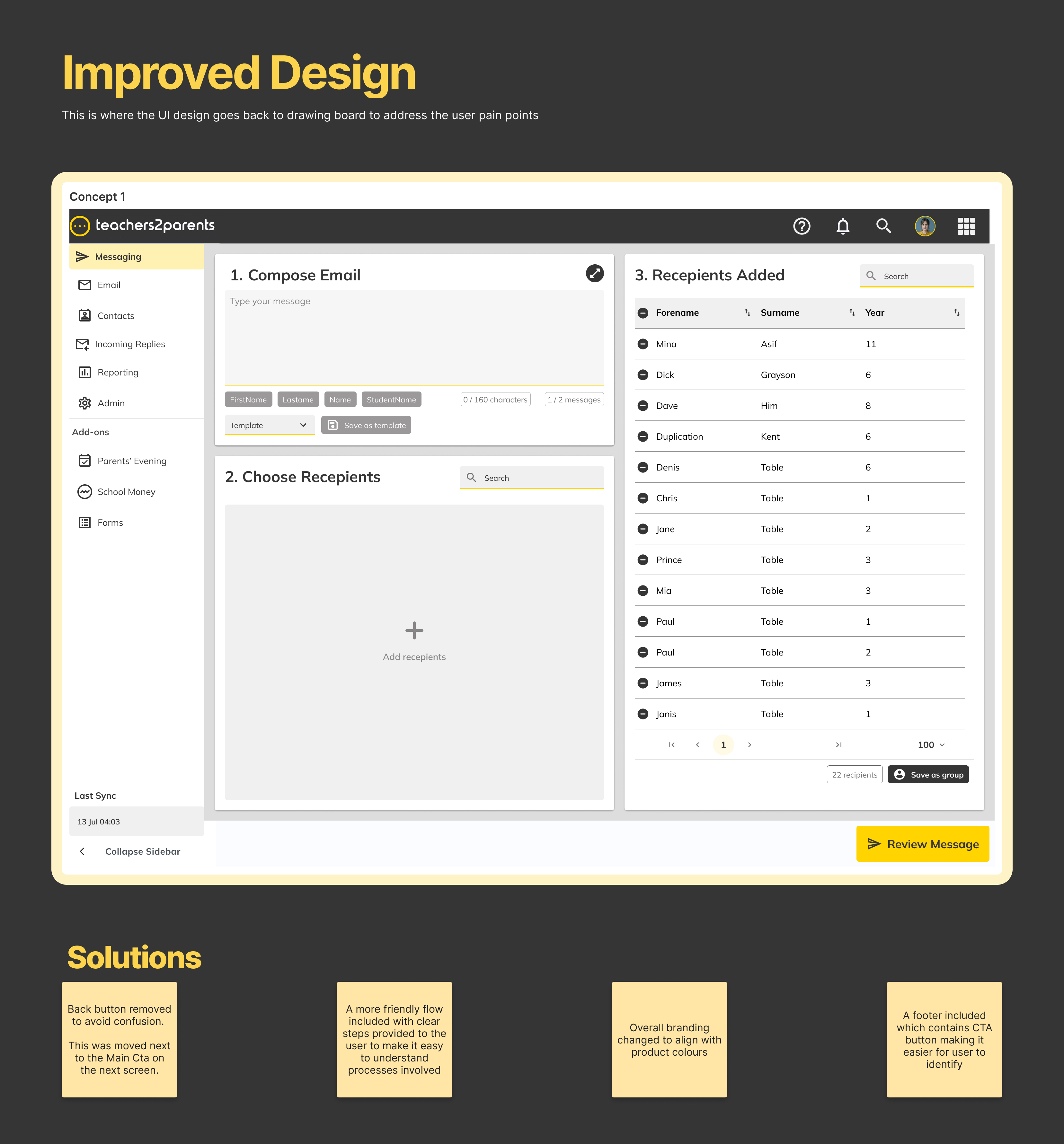
After — solutions implemented in the redesign
Feedback
What users said after launch
After launching the product to stakeholders and users, 99% of users were able to accomplish tasks set during usability testing. This was heavily reflected once the product went live.
“Easily show people how to use it. Quite confident in showing other staff how to use it within 10 mins.”
“Nothing to change because everything I need is there.”
Ease of use
Users found the new design easier to use than the old. The new design had a more intuitive navigation system, clearer labelling, and more prominent calls to action that made it easier for users to accomplish their goals.
Improved accessibility
The new design was more accessible, offering features that allow users with disabilities to better interact with the site. Call-to-action buttons were easy to find with visual hierarchy set throughout the entire product.
Better search functionality
The new design offered better search functionality, including an autocomplete feature that suggests search terms as users type and the ability to filter results by criteria such as price or product category. Search components were placed in areas that were easy to identify.
Impact
Measurable outcomes
99%
Task completion rate
100%
V1 to V2 migration
20%
Reduction in support tickets
Improved usability
Intuitive navigation, clearer labelling, and prominent CTAs made the platform significantly easier to use.
Cross-product influence
Validated design patterns were adopted across other products in the portfolio.