UX Research | Edtech
Basic Usability Testing — Teacher2parents
The Goal
Gaining qualitative feedback before release to market.
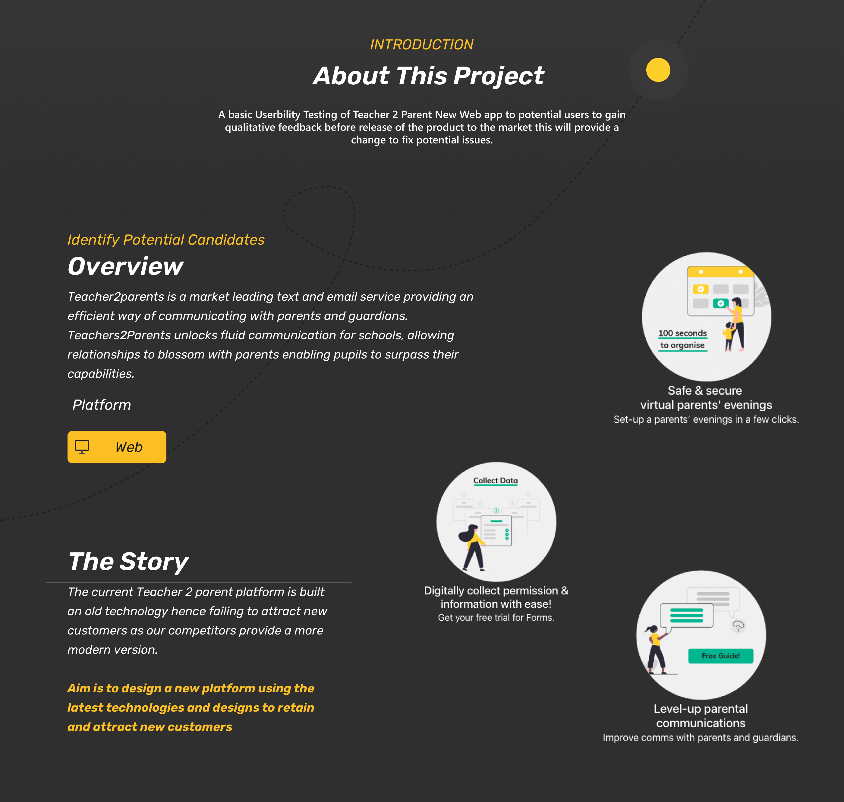
A basic usability testing of Teacher 2 Parent's new web app to gain qualitative feedback before release to market — providing a chance to fix potential issues.
Objective
The story behind the project.
The Teacher2Parents platform connects schools with parents through messaging, payments, and communication tools. Before launching a redesigned web app, the team needed to understand how real users would interact with it — uncovering friction points and validating design decisions with qualitative feedback from actual target users.
Project introduction — about the usability testing
Design Timeline
A 6-week research process in two parts.
April W01
Preparation & planning
April W02
Survey distribution
April W03
User interviews
April W04
Part 1 complete
May
Analysis & synthesis
Nov – Dec
Part 2 — iteration
My Role
Leading usability testing.
I led the end-to-end process — participant selection, testing methodology, and feedback synthesis. Sessions were conducted remotely via Microsoft Teams using a think-out-loud protocol, run by two people.
- Collate feedback & identify patterns
- Only change what users struggled with
- Avoid leading questions to reduce bias
Participants
Understanding the users.
- Tracy — Parent & School Administrator
- Howard — Teacher, daily T2P user
- David — IT Coordinator, first-time user
- Madeleine — Parent, used both platforms
Research
Surveys & interviews.
Surveyed 10 potential users (ages 20–50) for quantitative and qualitative data, then selected 8 for individual Zoom interviews with full product access.
- Survey for broad patterns
- 1-on-1 interviews for depth
- Screen sharing & task observation
Empathy Map
What users told us.
- Users found the navigation intuitive overall
- Clean visual design was appreciated
- Core messaging flow felt straightforward
- Payment integration was well-received
- Some users struggled with initial onboarding
- Notification settings were hard to find
- Mobile responsiveness needed improvement
- Certain labels were confusing for parents
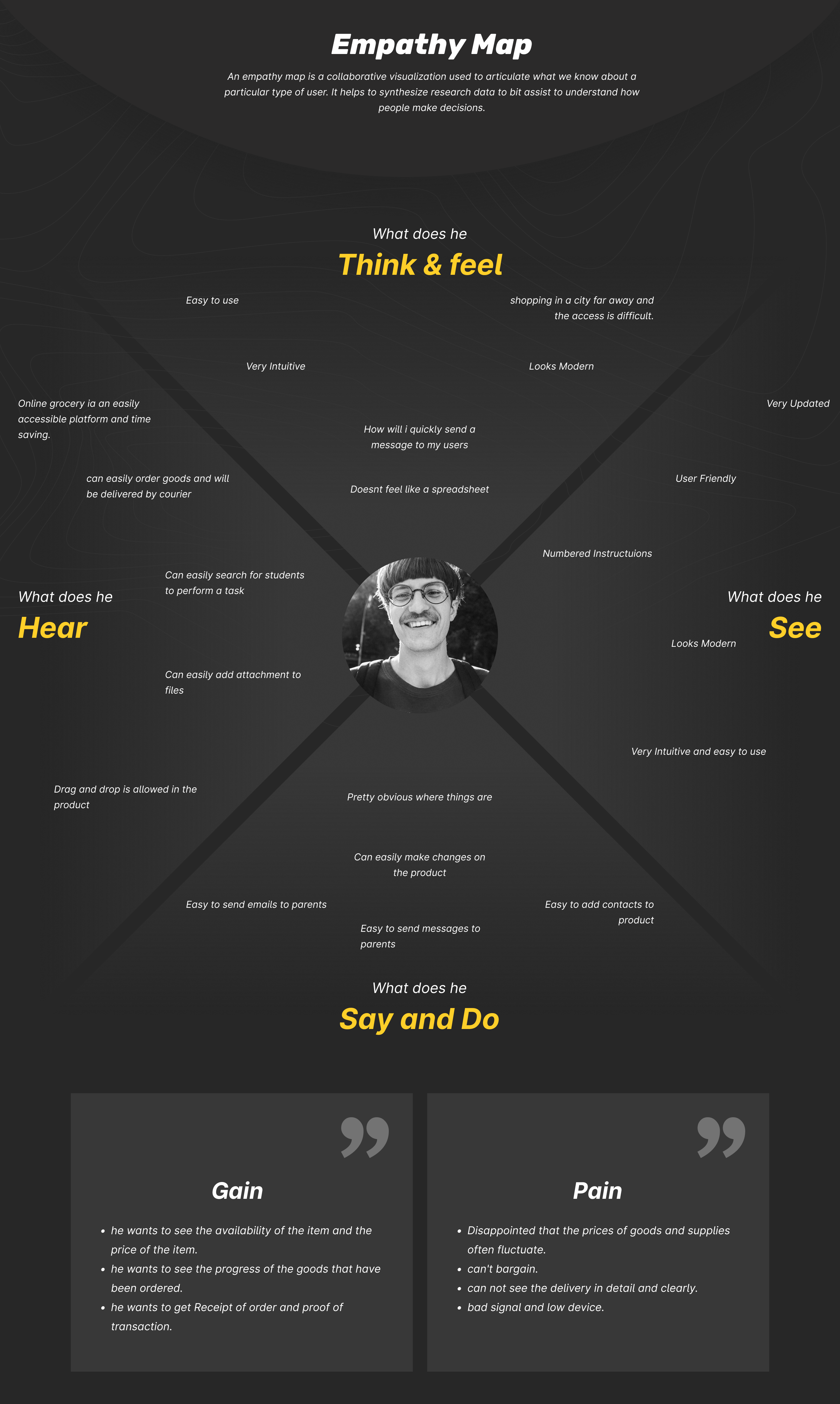
Empathy map — gains and pains from user research
Findings
Key insights from testing.
The usability testing revealed clear patterns in how users interacted with the platform. By focusing only on changes users had issues with rather than overhauling the entire design, we were able to make targeted improvements that addressed real friction points while preserving what was already working well.
"Only apply changes users had issues with, not the overall design."
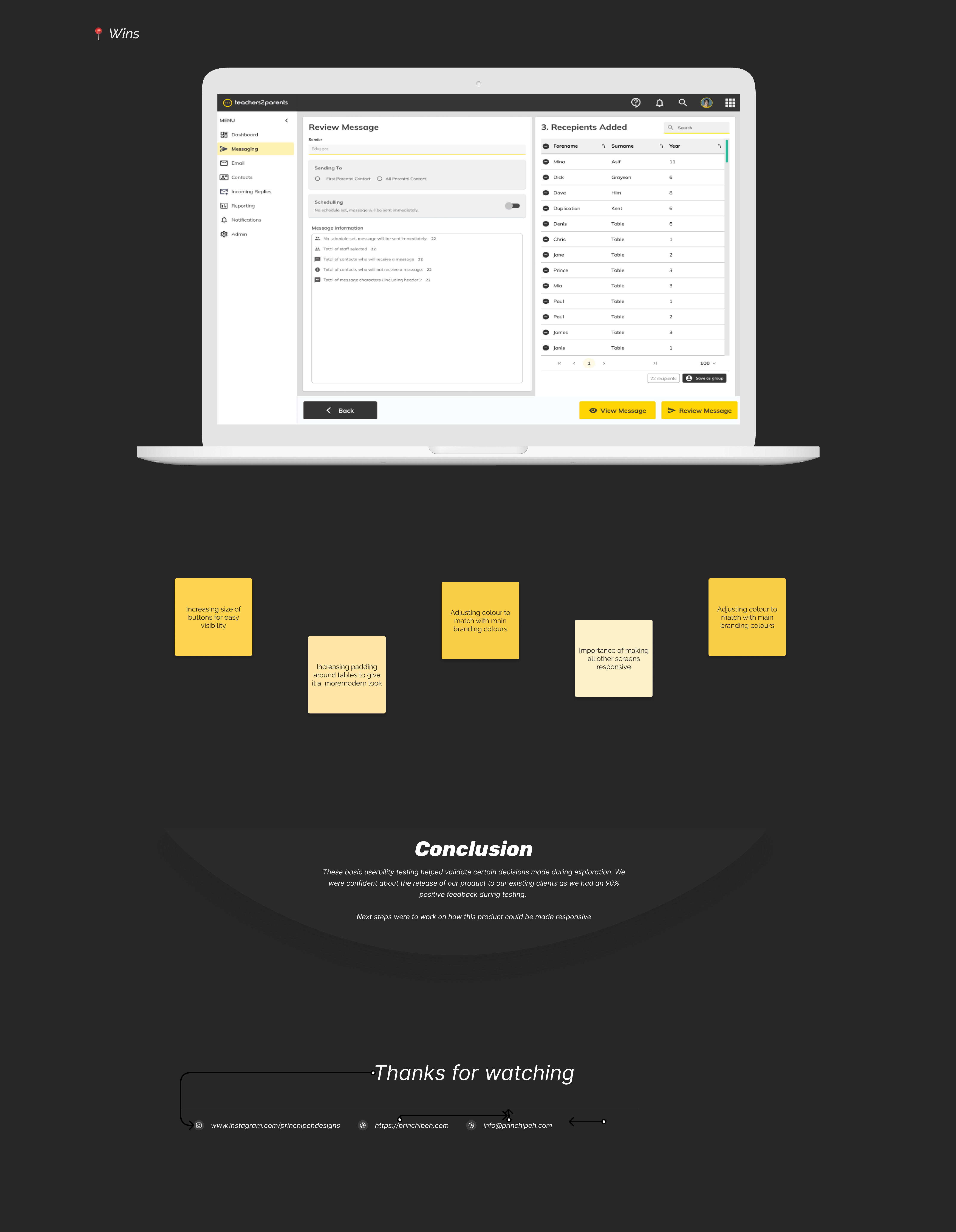
Conclusion — key findings and recommendations
Favourite Words
What participants loved.
Users praised the modern look, intuitive navigation, and sidebar layout. Common phrases included "very intuitive", "easy to navigate", "user friendly", and "love the drag-and-drop feature". Everything could be done from one screen.
Pain Points
Patterns from testing.
Key issues included struggling to find the contact and remove buttons, refresh returning to the main page instead of the current view, CTA and save-template button styling, and a missing floating review screen requiring extra scrolling.
Impact
What the testing achieved.
90%
Positive Feedback
Participants responded positively to the redesigned platform, validating the core design decisions made during exploration.
5
Key Improvements
Increased button sizes, adjusted brand colours, added table padding, improved responsiveness, and made all screens consistent.
v2
Responsive Roadmap
Testing confirmed the next priority — making the product fully responsive, which became the focus for the next release cycle.