The Challenge
Bringing T2P to every screen
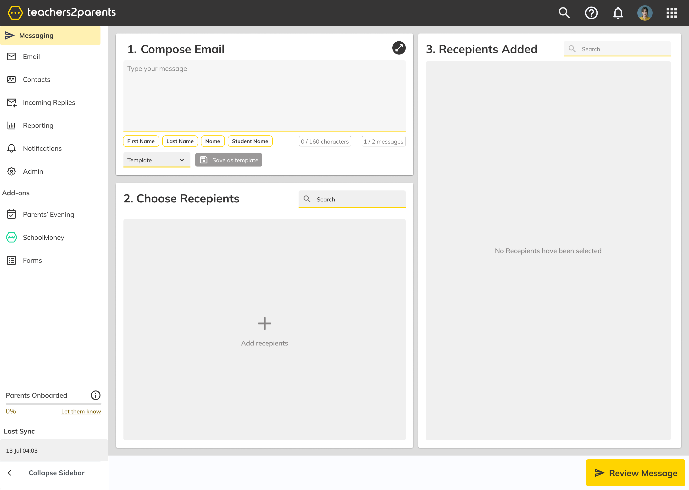
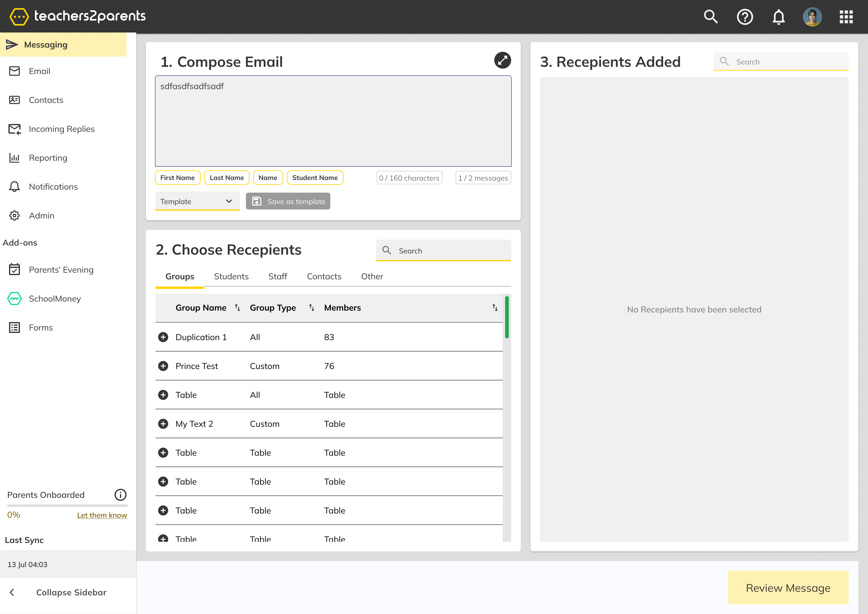
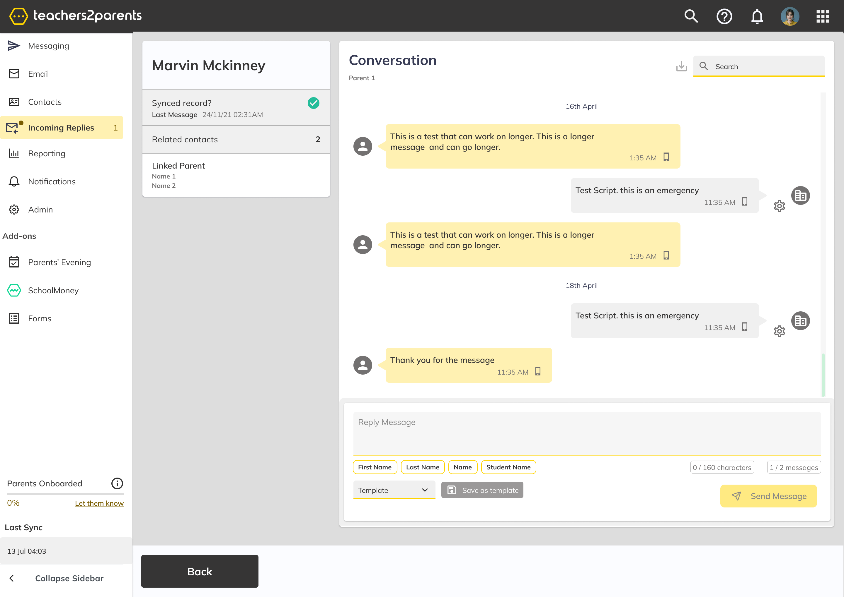
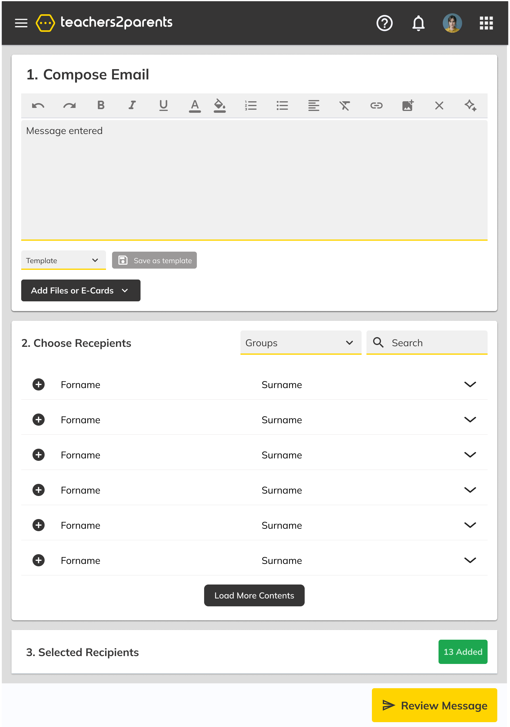
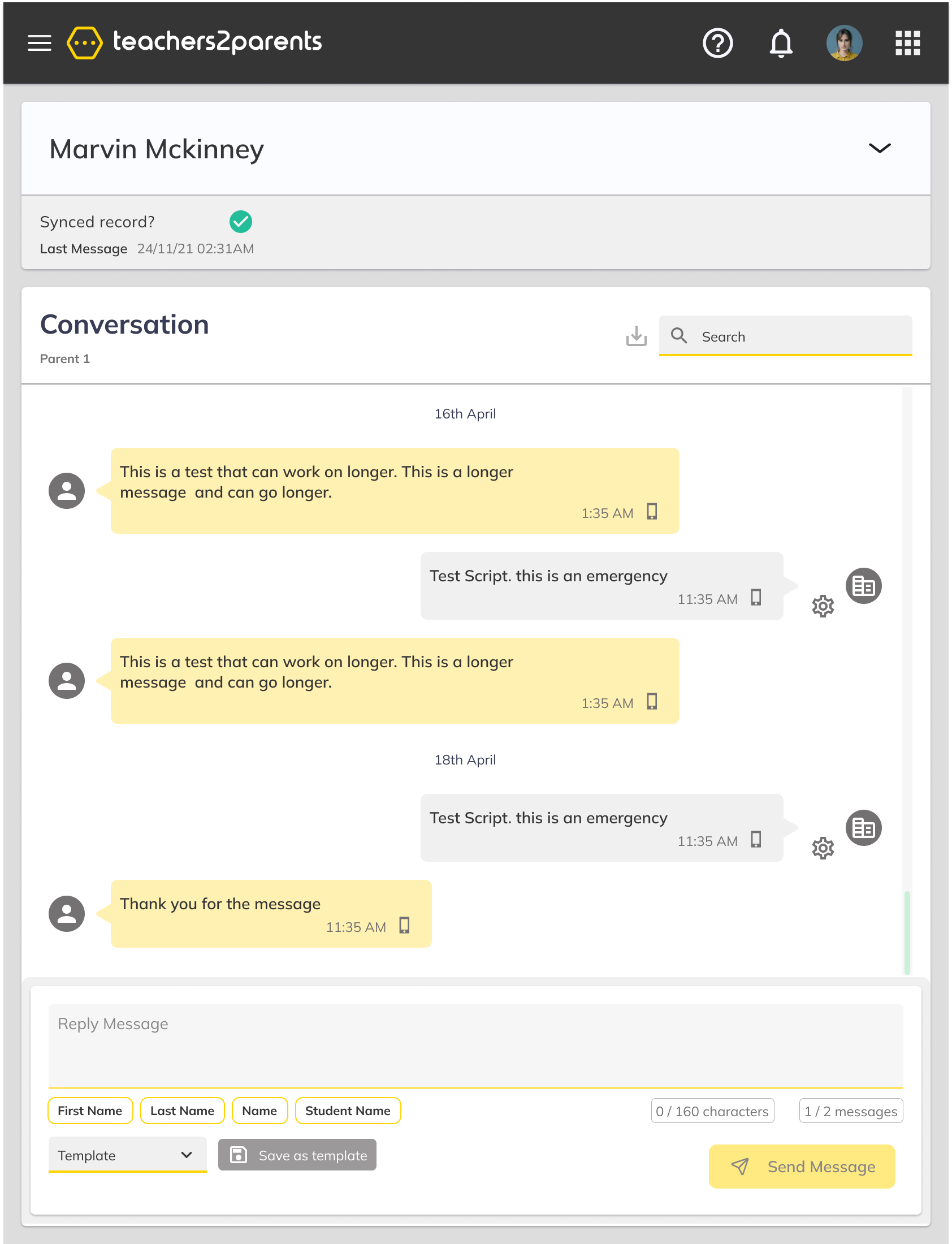
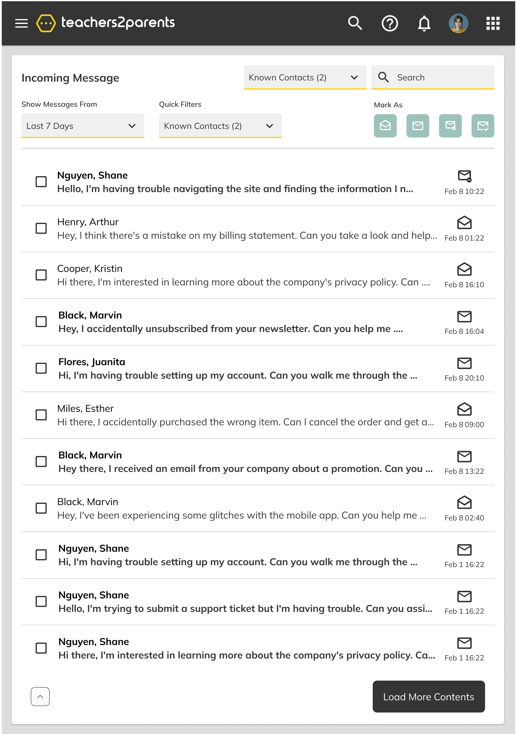
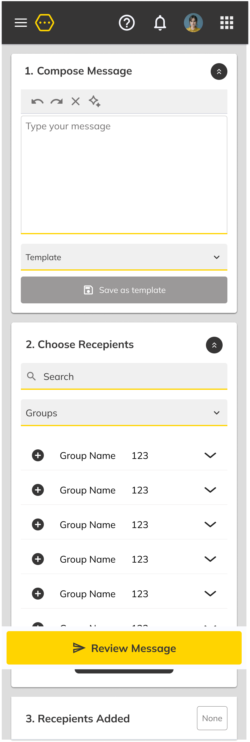
The legacy Teacher2Parents platform was built as a desktop-only application, leaving tablet and mobile users with broken layouts and inaccessible controls. The goal was to create a fully responsive web experience — including tablet views and a new sidebar navigation — then validate the approach through usability testing with real users.
Responsive Preview
See the design adapt.
Drag the right edge to resize the viewport and watch the layout respond.
← Drag to resize →
Validation
Tested with real users
4.28/5
Experience rating
100%
Task completion
3
Participants tested
"Big improvement on classic — the step-by-step flow makes sense and the responsive layout works well across devices."
- Responsive layout validated across all tested devices
- Step-by-step messaging flow rated intuitive by all participants
- Touch target and keyboard improvements identified for next iteration
Impact
Measurable outcomes
+30%
Platform engagement
Teacher engagement increased as staff could now access the platform from tablets and mobile devices, not just desktop.
3+
Cross-platform patterns
Validated responsive design decisions — including the collapsible sidebar and step-by-step compose flow — were migrated to other products in the portfolio.