Edtech | AI-Assisted Design
Groupcall Messenger Dashboard
 Figma Make
 Claude
 Storybook
The Goal
Redesigning how schools communicate — one dashboard at a time.
Groupcall Messenger is used by thousands of schools across the UK to send messages to parents via SMS, email, and app. The existing dashboard hadn't evolved with the product — admins had no clear entry point, no visibility over delivery performance, and no guided workflow to start their day. The brief was to rethink the dashboard from the ground up, using an AI-integrated workflow to move from research to a tested, production-ready design.
“School admins were logging in and immediately asking: what do I do first?”
Where We Started
The existing dashboard — functional, but outdated.
Before the redesign, the Messenger dashboard was a static grid of icon shortcuts — wizards, subscriptions, and resources laid out with no hierarchy or guidance. There was no visibility into messaging performance, no daily workflow, and no indication of what admins should prioritise when they logged in each morning.
The original Messenger dashboard — a flat grid of shortcuts with no user guidance
FigJam
Bringing everyone to the table.
The process started by bringing together stakeholders, developers, product managers, researchers, and marketing into a shared FigJam workspace. The goal was to align on what school admins actually needed to see when they logged into the dashboard each morning.
Through collaborative workshops, the team mapped out user types, messaging flows, data structures, platform analytics, and stakeholder relationships. This wasn't just desk research — it was cross-functional discovery that ensured every discipline had input before a single screen was designed. The output was a clear picture of the key areas users wanted the dashboard to surface: delivery performance, daily tasks, communication history, and app adoption.
FigJam research board — cross-functional discovery with stakeholders, devs, PMs, and researchers
Figma Make
From research to a first layout in minutes.
With the research insights locked in, the next step was rapid ideation. Using Figma Make, a complete dashboard layout was generated directly from the research inputs — translating the team's findings into a tangible starting point without spending days on wireframes.
Figma Make produced a working structure: sidebar navigation, a morning onboarding checklist, app usage donut chart, wizard shortcuts for common actions, and a message delivery data table. It gave the team something concrete to react to. But it was still generic — the hierarchy was flat, the data felt like placeholders, and there was no clear user journey guiding admins through their day. The value was speed: it collapsed the gap between research and a reviewable layout, so the team could start making real decisions faster.
Figma Make output — a structured starting point generated from research inputs
Claude
Layering in intent, hierarchy, and intelligence.
Once the team approved the general direction from the Figma Make output, the design moved into Claude for a deeper iteration pass. This wasn't about regenerating the layout — it was about refining what was already there with more design intent.
Claude helped restructure the content hierarchy, adding a messaging analytics bar at the top of the page (delivery rate, read rate, response rate, money saved), a carousel-style onboarding flow that guided admins through their first tasks, app usage growth metrics with trend indicators, and a richer quick report section with additional data tabs. The result was a layout that felt purposeful rather than generated — but it was still a hypothesis. It hadn't been tested with real users yet, and several assumptions about what admins valued most were still unvalidated.
Claude-refined version — analytics bar, richer data hierarchy, and guided onboarding added
Claude + Storybook
Code as a source of truth — not just Figma.
This is where the workflow diverged from a traditional design process. Rather than handing off static Figma files to engineering, the refined components were built directly in code using Claude and documented in Storybook — creating a living component library that existed alongside the Figma design files.
For the first time, the team had a dual source of truth: components that were both designed in Figma and functional in code. This made it possible to spin up a working prototype quickly and test with real users — not just clickable mockups, but actual components rendering real data.
User testing with school admins revealed critical gaps that none of the AI-generated versions had surfaced. Admins needed a guided daily workflow to structure their morning routine. They needed visibility into app adoption rates, not just message delivery stats. And they needed every metric to connect to an action — not just display information, but tell them what to do next.
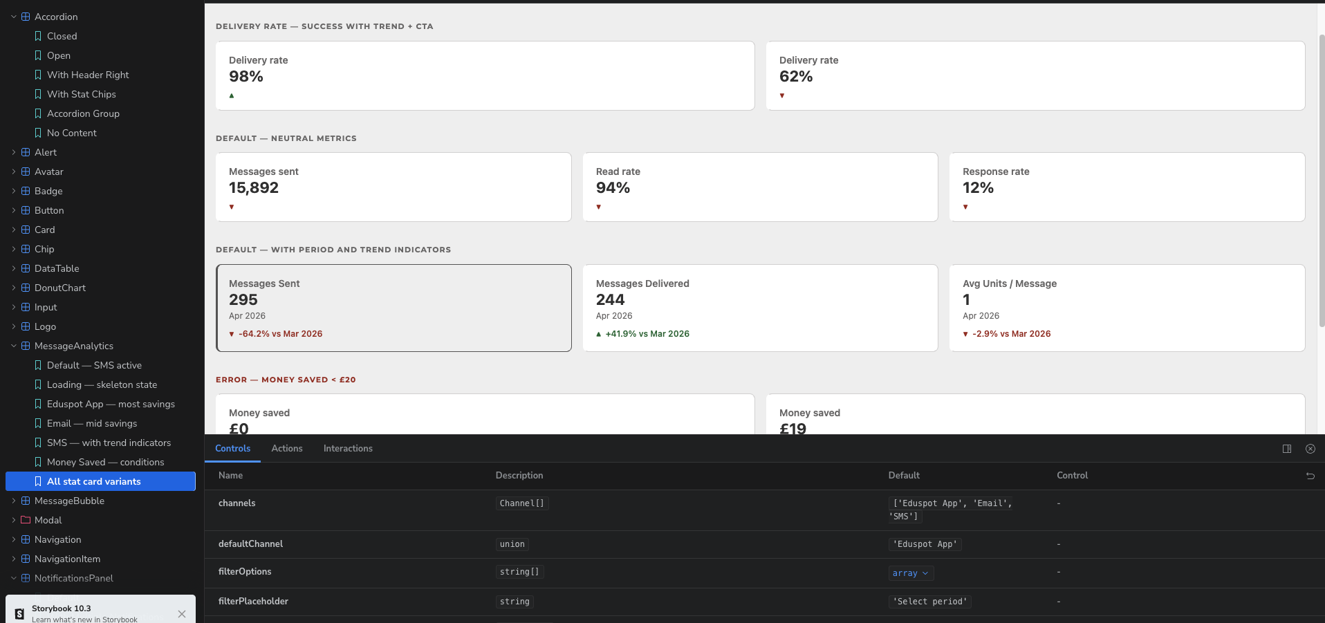
Storybook component library — stat card variants with trend indicators, built directly from design specs
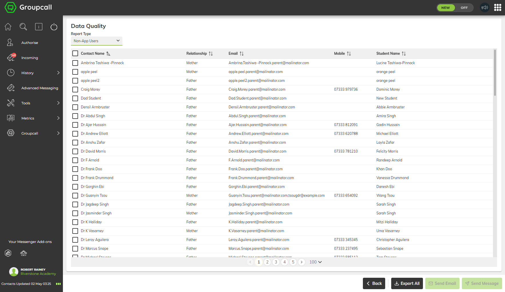
Data Quality report — Non-App Users list with actionable export and messaging options
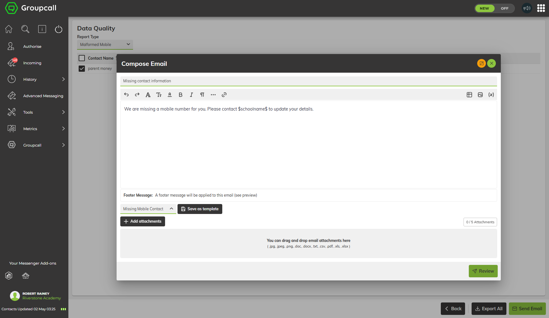
Email composer — end-to-end workflow from data quality issue to parent communication
Shaped by users, not just algorithms.
The shipped dashboard is significantly different from every AI-generated version — and that's the point. User testing reshaped the design in ways AI couldn't have predicted.
Three major additions came directly from testing: “Today at a glance” — a guided daily checklist (send absence chases, process incoming messages, review delivery summaries, check contact accuracy) with progress tracking that gave admins a clear starting point each morning. App Enablement — a donut chart showing that 99.3% of parents weren't using the app, making adoption the most visible metric on the page and connecting it directly to an onboarding action. Actionable KPIs — every stat (SMS delivery rate, email delivery rate, messages via app) paired with an inline CTA: “Improve Rate” or “Onboard Parents.” No metric exists without a next step.
The final design also includes a 6-month messaging analytics breakdown and detailed delivery stats — features that the AI versions had attempted but the final design executed with real data and real purpose. The result is leaner, more focused, and every section earns its place.
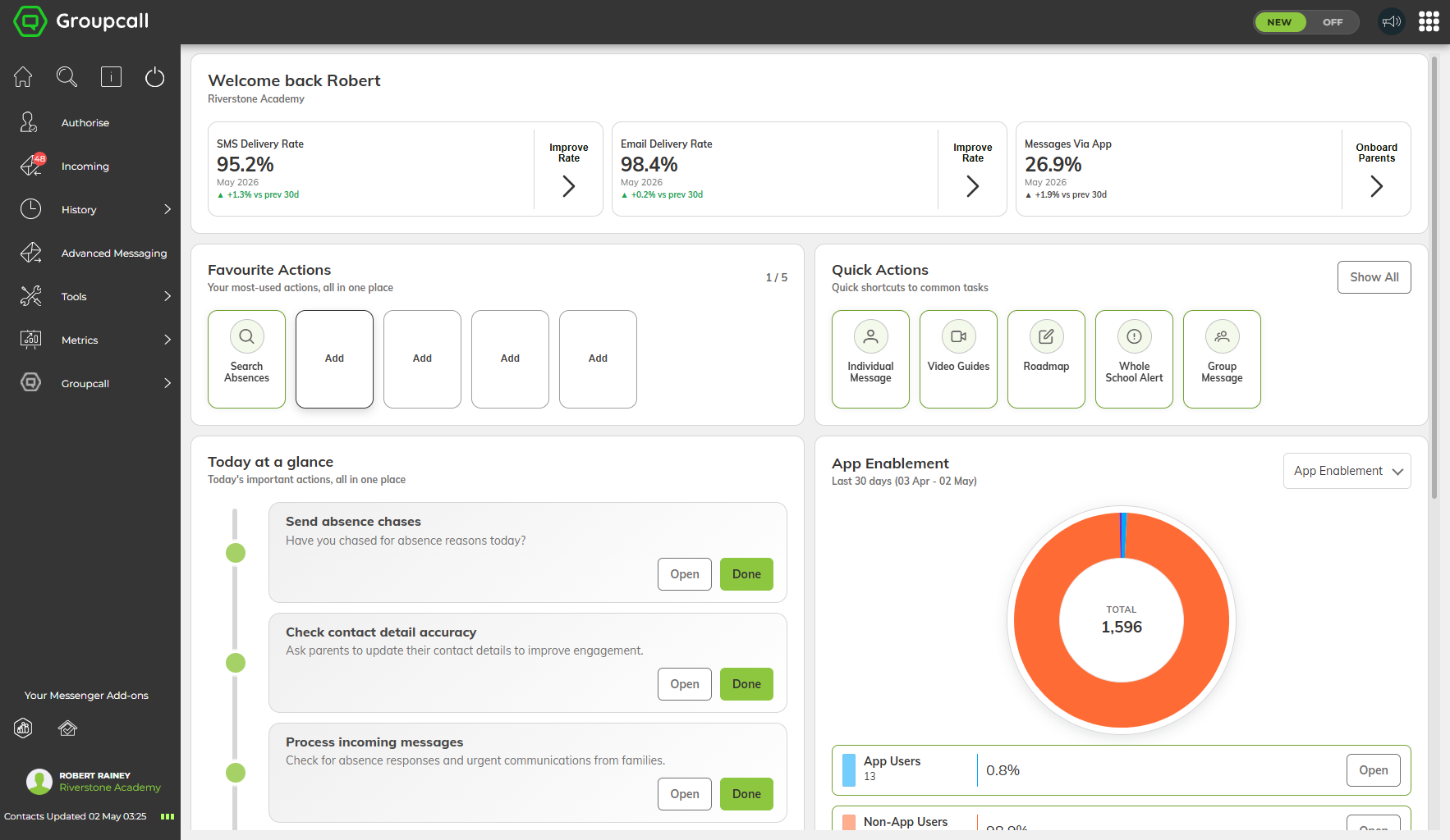
Shipped dashboard — KPI bar, favourite actions, quick actions, and guided daily workflow
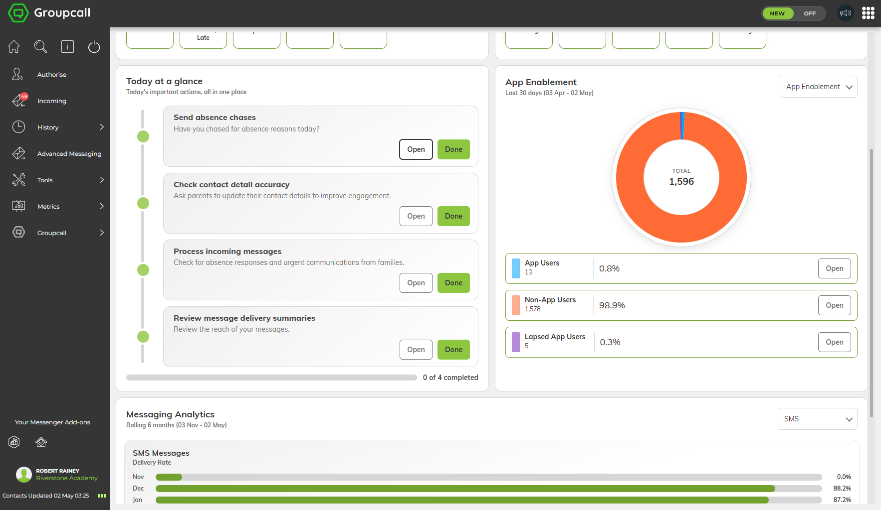
“Today at a glance” — guided daily tasks alongside app adoption metrics and messaging analytics
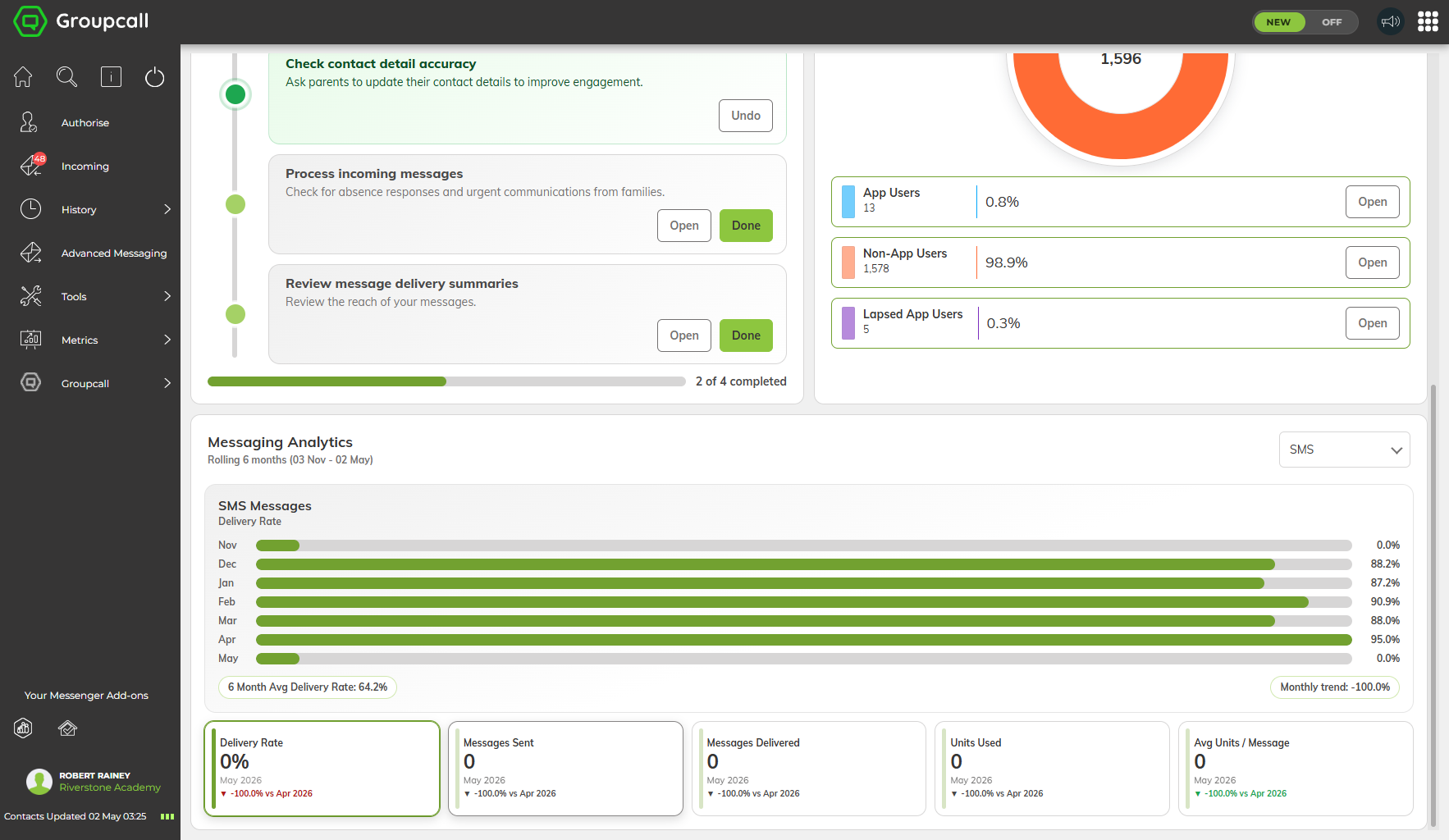
Messaging analytics — 6-month delivery trends, actionable KPIs, and task progress tracking
Key Insight
“AI got us to 60% in a fraction of the time. User testing told us which 40% actually mattered. The combination is the workflow.”